20 Minutes Fitness is a rapidly growing company in the field of EMS training, offering a revolutionary approach to exercise: just 20 minutes are enough for a full workout, thanks to its advanced electrostimulation technology. With studios across multiple locations and a wide, dynamic audience, the brand is consistently building the next chapter in fitness.

The Request
Brand Repositioning
20 Minutes Fitness approached us with the need to redefine its corporate identity—both strategically and creatively. The goal was to consistently express the brand’s philosophy and momentum, enhance its perceived value, and develop a contemporary narrative to support its growth. This was not merely a visual refresh, but a holistic strategic repositioning aimed at creating a strong identity that combines the power of technology with simplicity, speed, and effectiveness.

Unser Ansatz
From Insights to Identity Creation
We adopted a multi-layered, strategically structured approach, starting from the core of the brand and culminating in a complete transformation of its external image.
- Brand Analysis & Strategy: We conducted an in-depth analysis of the existing identity and key brand associations. We redefined the brand’s “why” and placed its core promise front and center: “Training that adapts to your life.”
- Brand Storytelling: We crafted a clear and distinctive brand narrative that balances functional and emotional benefits. At its core lies the concept of time: energy, reset, and balance.
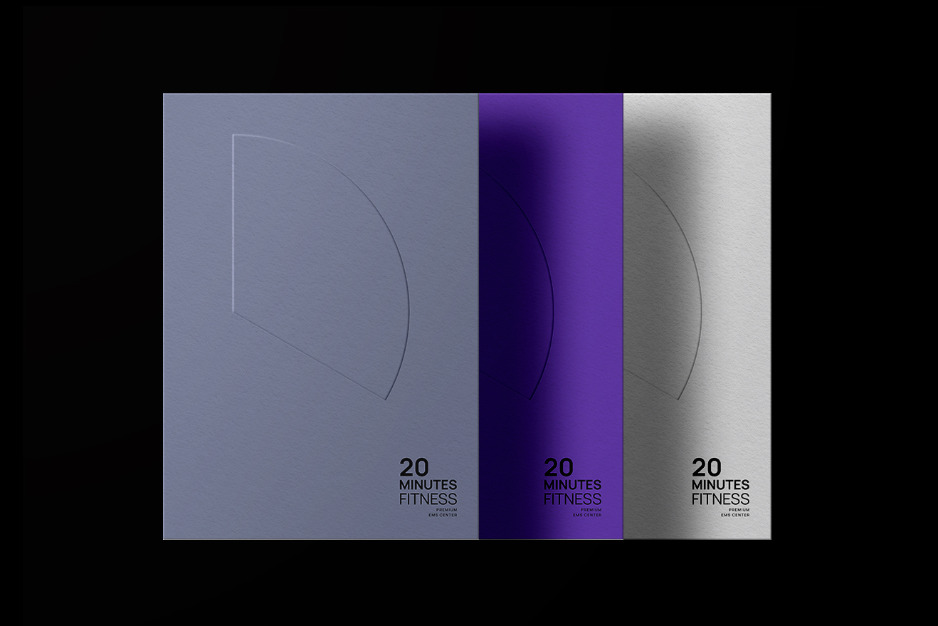
- Visual & Brand Identity: To translate the new brand narrative consistently and powerfully, we designed a comprehensive visual system grounded in minimal, geometric aesthetics, technological precision, and a premium feel.
This new identity is not just an aesthetic enhancement—it integrates the brand’s strategic positioning into every visual touchpoint.
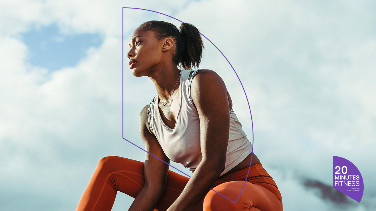
Visual System Highlights
Designing a Distinctive Identity
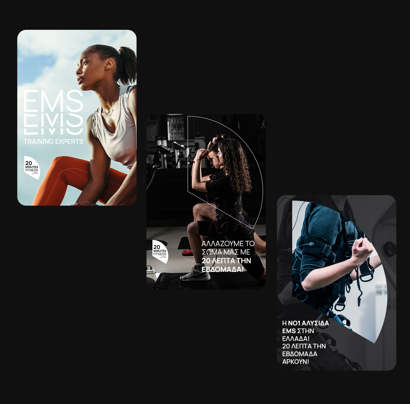
The new identity’s visual system was designed to deliver a premium, flexible, and recognizable brand experience at every level. By unifying all visual elements—from the logo to application materials—we crafted a cohesive visual language that clearly communicates the character of 20 Minutes Fitness: modern, technologically advanced, and accessible.
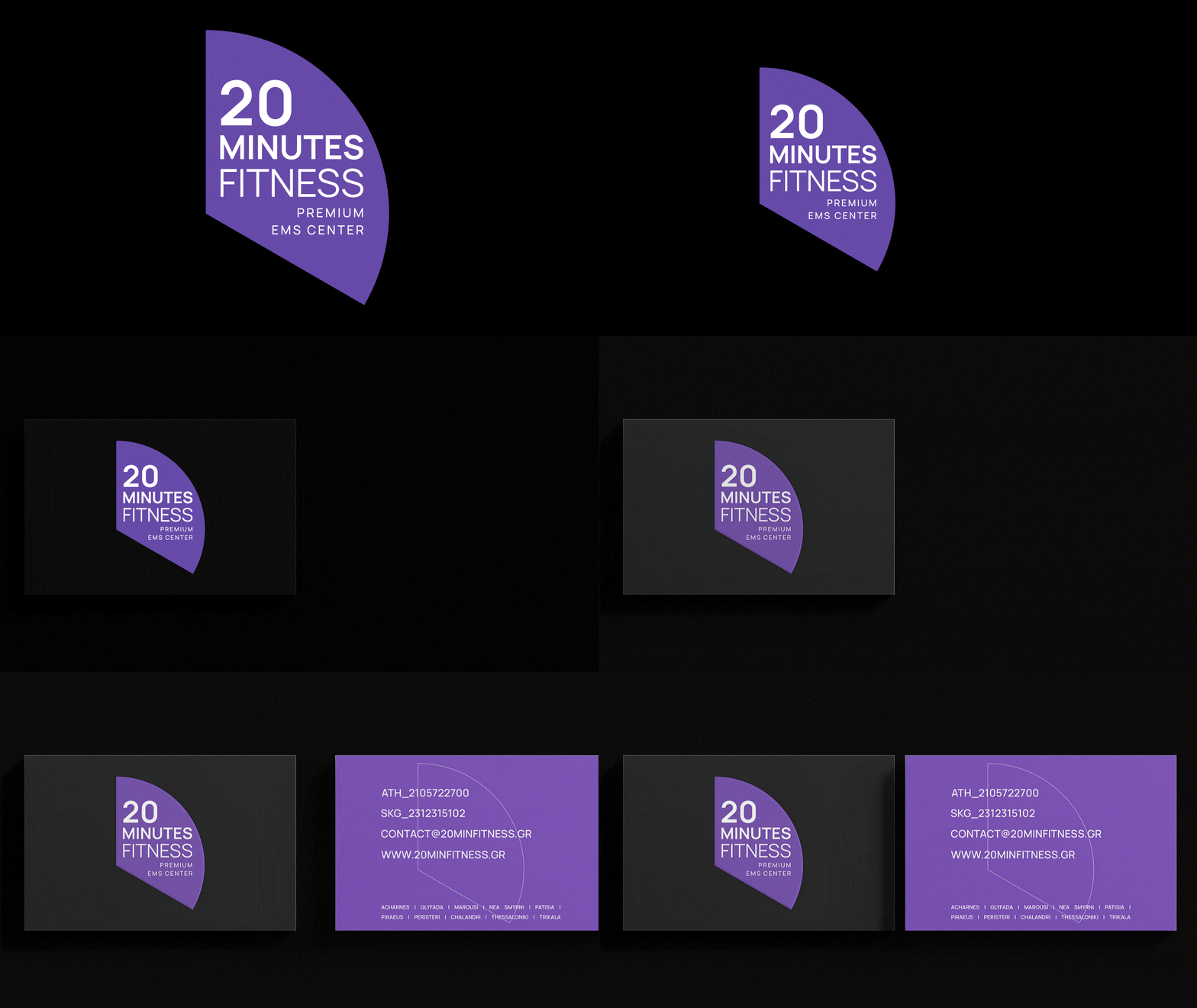
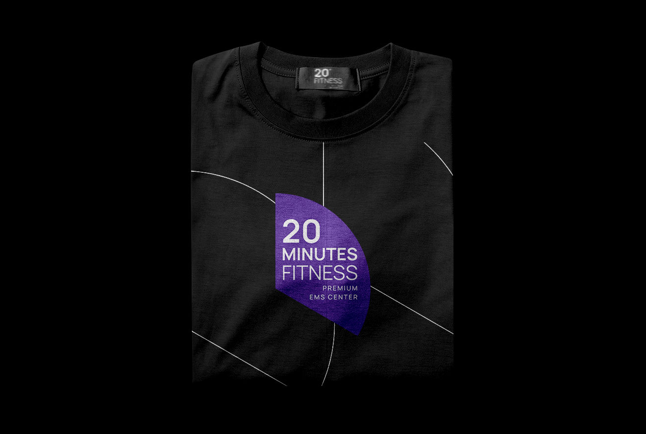
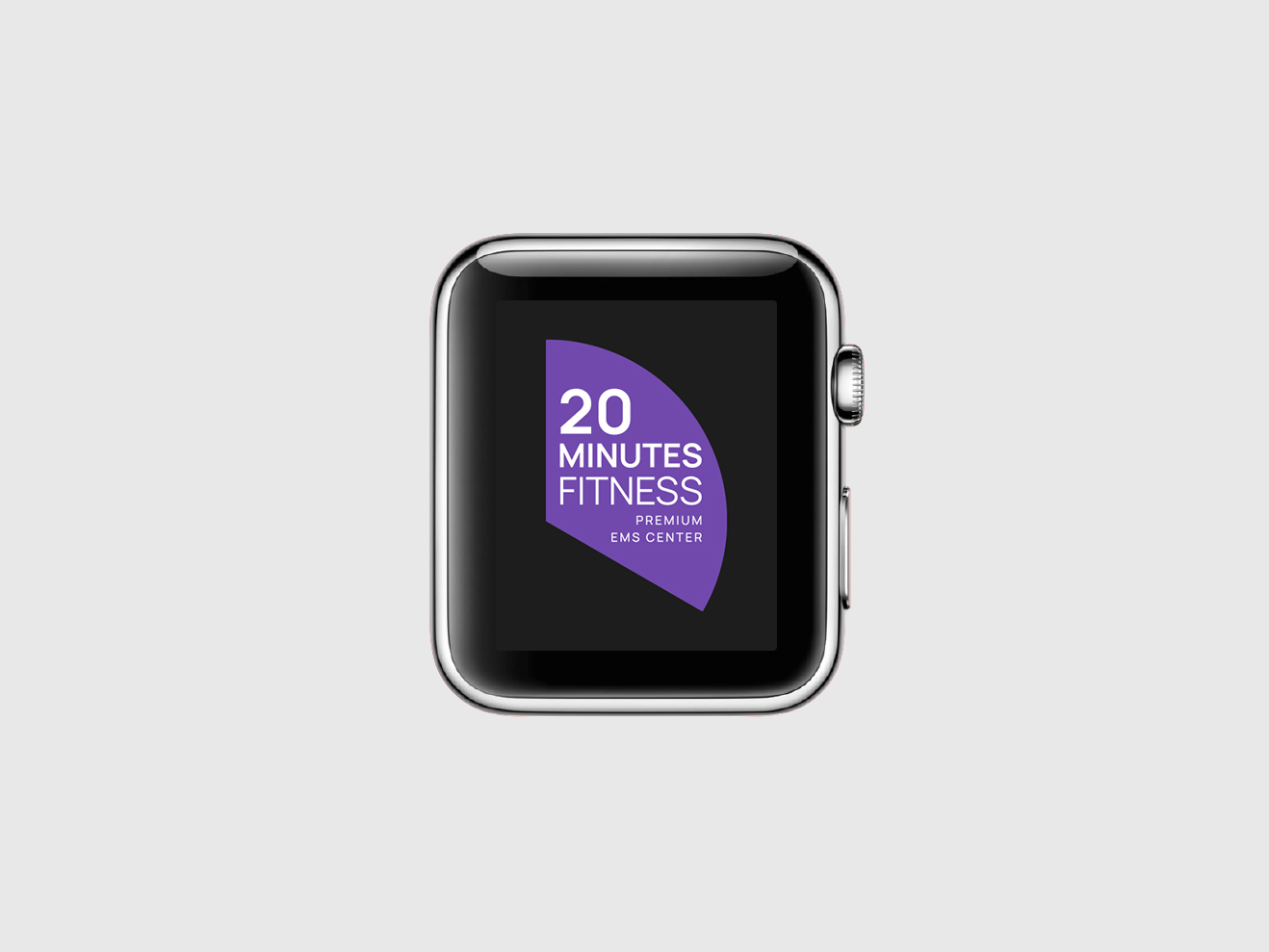
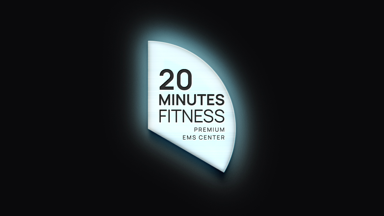
- Logo with a contemporary geometric structure and dynamic form, inspired by the 20-minute concept and human body shape
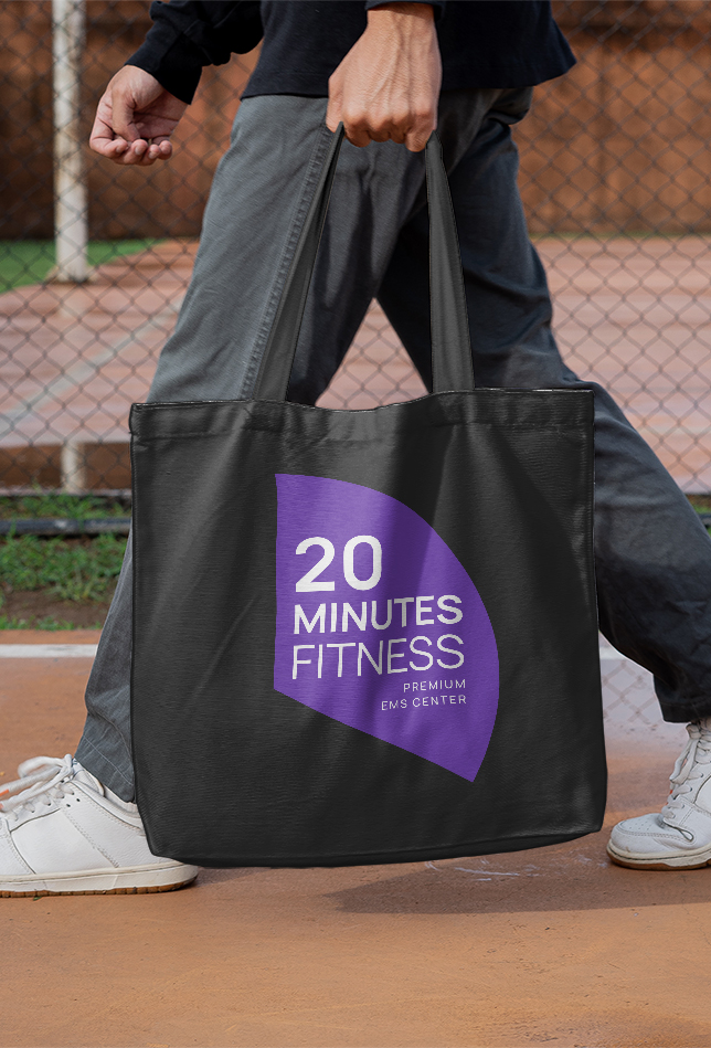
- Primary color palette: Electric Purple & Deep Black — a blend conveying intensity, energy, and a premium tone
- Secondary shades: cool metallics & neutrals for depth and versatility across applications
- Custom pattern with subtle circular arcs that unify visual assets across formats
- Minimal typographic system using sans-serif fonts that balance clarity and accessibility
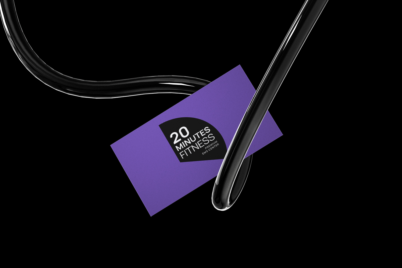
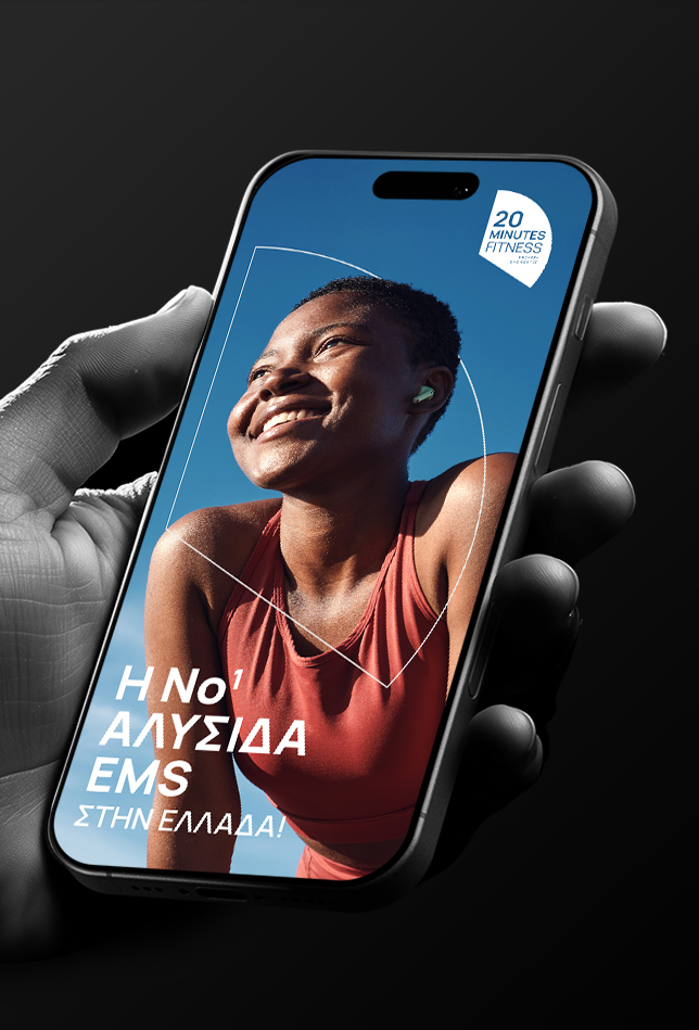
- Identity application across business cards, digital assets, apparel, packaging, signage, and social media with high aesthetic consistency.
The visual system supports scalability and implementation across all brand environments, strengthening recognition and establishing a distinct, signature look.
